Making Milan “global” by improving signage and wayfinding in the city
Old times were simpler times. City, town and countryside were equally benefited, during the industrial era, from the value of the land, the continuous search for cheaper labour and the flexibility that transport links could offer. Manufacturers did not need to cluster in big cities to secure their success; they only had to go where cheap land and labour could be found, ultimately benefiting the area of their selection and its residents too. Industrialisation was the way for less successful countries to quickly catch-up; they just needed to find something they are good at and at a lower cost from other countries in order to compete with them. It was not an easy task, but it was far easier than what countries have to compete with today.
It is true that we have moved far away from the industrial era. Now, it is the service economy that is rising. The main difference from before is that agglomeration, clustering in densely populated areas, is now very beneficial. After the industrial decline, big cities tried to replace the industrial production with high-value services, such as finance, technology, culture in order to compensate for the big loss, whilst some others, smaller ones like Greece, struggled to build strong services. The result of this was regional divergence which became more apparent after the mid-2000s. More specifically, a polarisation is formed within the EU, between super successful cities-regions that attract young, high-skilled people and others that continuously try to keep up.
MILAN AS A CASE STUDY
Milan is a good example of a city that successfully managed to transcend from the industrial era to the service one. Milan boomed during the Industrial Revolution as a significant part of the workforce shifted from agriculture to heavy industry with millions of people moving to Milan, making the South weaker. Thousands of factories were built producing automobiles, motorcycles, motor scooters, airplanes, electric appliances, railroad materials, chemical productions and textiles, while commercial activity was also stimulated with export trade being of great importance. After the oil crisis of the 70s, when factories were forced to downsize, the city started to move towards a new era; services gradually replaced goods bringing Milan closer to what it is today: a city of artists, fashion, researchers, scientists, culture, sports, politics and communication. It is considered to be one of the most successful post-industrial cities attracting young and talented people, not only from Italy but from across Europe and beyond.
The new Milan is no longer a traditional Italian city. It is evident that Milan has become more international to keep up with the new reality and the rest of Europe. It is the place where people can find opportunities that do not exist elsewhere in Italy and for that reason, the city itself had to change and become GLOBAL. Happy globalisation is the new motto today and Milan surely supports it. To make this message clearer, the city is going through a re-branding process. More particularly, Milan wants to declare that it is “open for business”.
This is all good to hear, but how “open” the city really is? It is said that Milan is a city of many layers and this is positive because it means that the history stays on and it is not being forgotten. However, what if these layers make the city harder to read by the newcomers? Would not that contradict the message for an “open city”?
WHAT IS PLACE BRANDING?
Place branding is an multidimensional urban strategy. It started with the emergence of the post-industrial society and globalised world and economy where countries, regions and cities had to compete with each other over people, resources, services and businesses. Overall, place branding is a strategy for projecting images and managing perceptions about places. It is not only based on communication strategies, but on other elements too, like infrastructure, quality of local services, transportation system etc. ; all of these compose the brand identity of a place. Some examples of good branding are: New York (I love NY), San Francisco (Tech City), Paris (City of Light), Jerusalem (Holy city), Las Vegas (Sin city), Amsterdam (WE Amsterdam). Essentially, the aim is to turn places from locations to destinations.
In this context, some ideas for signage and wayfinding will be presented here as good examples for low-cost interventions that can benefit place branding strategies. Surely, this is only the tip of the iceberg, but it is important to stress how small wins can significantly contribute to a new image for a place.
WHEN IN MILAN
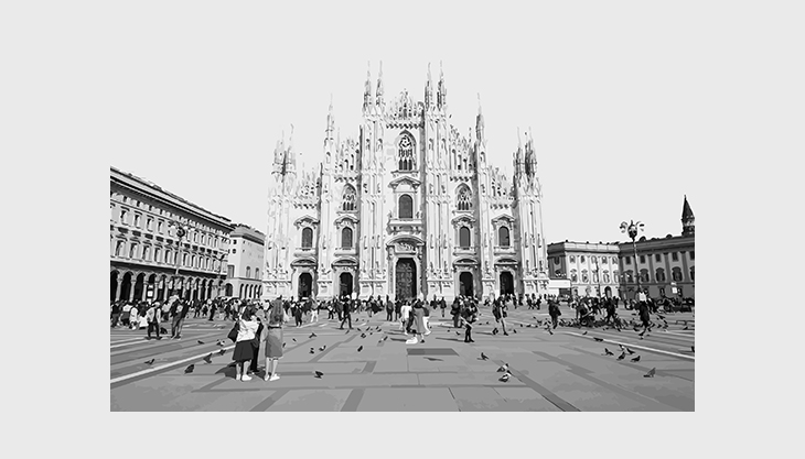
Arriving in Milan. I remember arriving at the city centre from the airport. The first thing I noticed was the Central Station; what a landmark. At that point I thought, yes, I am in Milan. Then, till the point I finally reached the city centre, it was all a blur; no signage indicating the direction towards the city centre, I had to use my phone GPS the whole time to navigate myself around, while also trying to keep an eye on the cars, scooters, trams, bicycles that were sharing the same carriageway. I remember being so confused and overwhelmed.
Sightseeing in Milan. I had to use my phone every time I wanted to go from point A to point B. I remember feeling the need to check my phone every now and then just to make sure I was on the right path. This is when I realised that the signage system in Milan could use some improvements.
When walking around Milan, as a pedestrian, the amount of information that one receives is huge and non-filtered; nothing stands out because there is no hierarchy of information. As a result, there are either heavily used streets or underused ones. There is nothing wrong with this, but in a perfect scenario, an open city should welcome both popular/desired routes and spontaneous ones. Otherwise, millions of people end up taking the exact same route. It is no wonder why you see so many people around Duomo and the main streets, but less people in surrounding streets. The pedestrian flows are formed based on the main landmarks rather than a more general pattern that welcomes a wider exploration of the city. No one wants to take the risk of getting lost, no one can afford it, especially if only staying in town for a couple of days. An open city should make people feel comfortable taking risks and walking around without having to check their phones all the time. It needs to make people feel spontaneous and willing to get lost in the urban fabric.
London is the first city that comes to my mind when I am thinking of a good signage system. Wide streets, landmarks, open spaces and signage work perfectly together. Personally, since the first time I walked around the city centre, I felt like the roads were leading the way for me and I was going from one point to another without feeling any uncertainty. I knew where I was, even approximately, at all times. Of course, London has a strong asset that facilitates legibility and wayfinding; the river Thames. Water features, as physical borders, can enhance legibility and orientation.
Milan by night. Walking in Milan by night, for a newcomer or tourist, is easier than during the day. Most parts of the city are asleep, so pedestrian flows can guide you. I remember finding Navigli easier by night than during the day, because most of the people would also walk towards the same direction, so they would lead the way.
Summing up, the overall impression from Milan was that of a metropolitan city, indeed, with a hidden beauty that is more likely to be found by the locals than anyone else. The lack of signage gives the impression of a city that mostly depends on local tourism and does not want to make it easier for anyone else.
EXISTING CONSTRAINTS FOR MILAN CITY CENTRE
Understanding the qualities of the place and the characteristics that make it unique, is an important step to work on place branding. In the case of Milan, these characteristics are the things that you first notice, the things that you love and hate about it. These are:
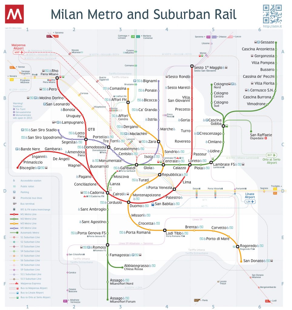
Street network. The street network system in the city centre is complex, but similar to many other European cities. There is a radial street network (no.1 on the map below), an organic street system (no.2 on the map below) signalising the historic core and an orthogonal street system (no.3 on the map below) singalising the more recent additions in the city fabric. These three categories do not meet within the historic core and thus, there is no street hierarchy that could enhance legibility and facilitate people moving around the centre. However, where they do (no.4 on the map), they do not really interact with each other. The general feeling is that the existing street network favours vehicular movement and hinders pedestrian permeability.
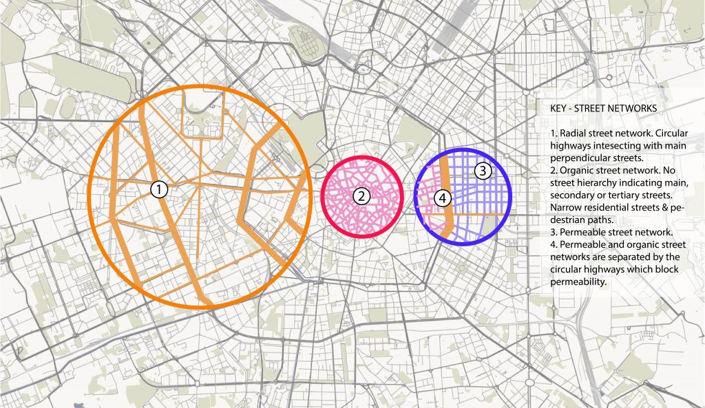
The lack of street hierarchy within the city fabric, the lack of intersections and the organic street system reduce legibility and make it harder for people to memorise streets and to easily navigate around. Permeability is also affected when street patterns are not well integrated into each other. There might be parts in the city that work well in terms of permeability and flow, but those are just patches of good street network, whilst at the same time the rest of the city centre suffers.
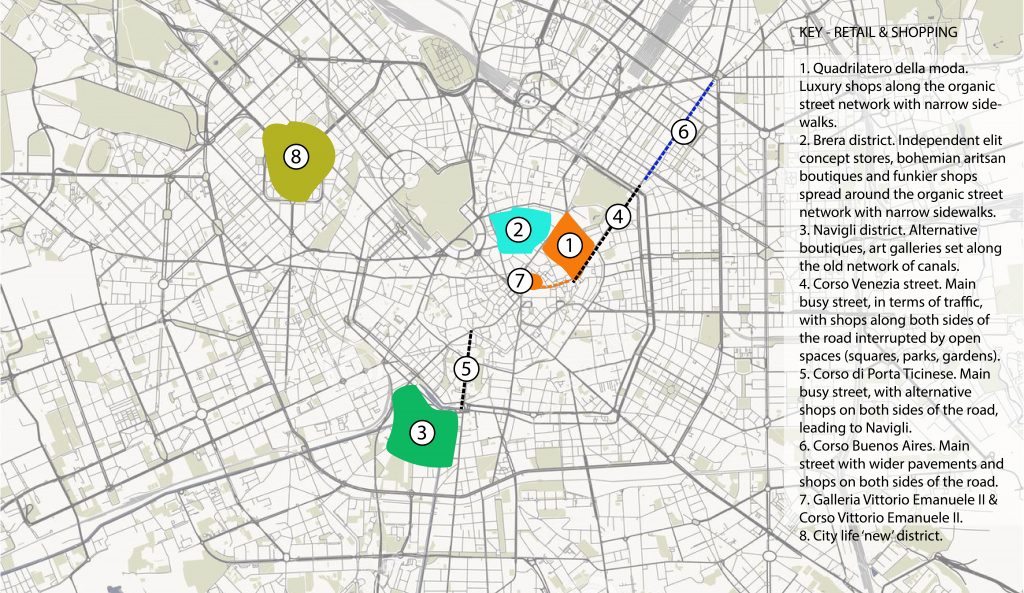
Independent shops: The number and variety of independent shops in Milan is big. Fashion and shopping are two of the reasons that someone would visit the city. Shops are spread all over the city centre with no particular pattern, whilst there are also commercial streets and districts where shops are more clustered, including mainly international or luxury brands (shown on the map below).
Due to this spread of the independent shops and the lack of signage in the city, the majority of the people tend to visit the commercial districts and streets to do their shopping. Even touristic guides suggest the same. However, Milan is the place to visit because of the independent shops. Therefore, the street network, the signage system and the city in general, need to focus more on highlighting these shops as part of the re-branded image.
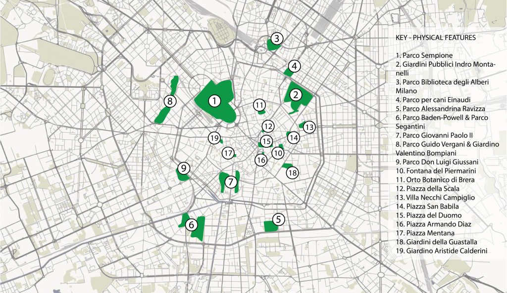
Green spaces, open spaces: It is clear that there is a lack of green spaces and public squares within the narrow and organic fabric of Milan city centre. Indeed, there are only two main green spaces at the borders of the city centre; Sforzesco castle and Giardini publicci indro montanelli, whilst there is a small number of open spaces within the historic centre.
This affects the legibility of a place and a person’s ability to memorise a route. The narrow organic streets do not allow for long distance views that can help navigation, but on the contrary, they only provide short sighted glances of what might be coming in the next corner. Open spaces within this organic street network can improve these views and offer possibilities for sitting, resting and socialising as well.
Transport network. There is a surprising variety of means of transportation within the city of Milan which amazed me when I first visited it (shown on the map below). Trams, vehicles, bicycles, buses, scooters, all coexist on the carriageway. As a result, there are many traffic lights, each one corresponding to a different means of transport.
This is an undeniable sign of progress, but it also creates confusion if not followed by an appropriate signage system and public realm improvements. Shared surfaces have many positives, but they can also cause many accidents and confusion to their users.
TURNING CONSTRAINTS INTO STRENGTHS VIA SIGNAGE TECHNIQUES
These characteristics summarise the identity of the centre of Milan, as well as highlighting its weaknesses. These weaknesses contradict the vision for the re-branded open Milan. However, as mentioned in the beginning of this blog post, the aim here is to suggest some low-cost signage techniques that can help turn these weaknesses into strengths and reinforce the vision. Some of these techniques are presented below:
Paint Milan
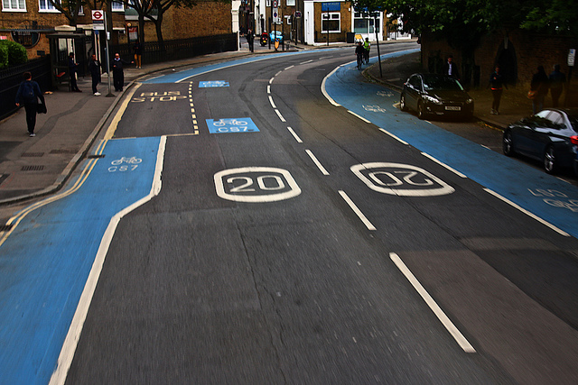
Colour techniques are found to be very useful in signage and wayfinding. Colour-coding could facilitate movement on the road where so many different means of transport coexist. This suggestion refers to cycle routes, tram routes or even traffic lights aiming to facilitate legibility for cyclists, pedestrians and drivers.
The example of London concerning coloured cycle lanes is a good one; coloured cycle lanes make the cyclist feel safer when being on the road, since he/she can be fully aware of the designated route. For example, there are times when, if you are not very familiar with the area, it gets complicated to even know where the lane goes after a junction. Therefore, being able to see the coloured route from distance is a quick way to help you navigate yourself.
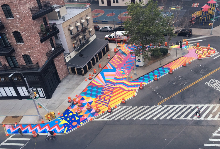
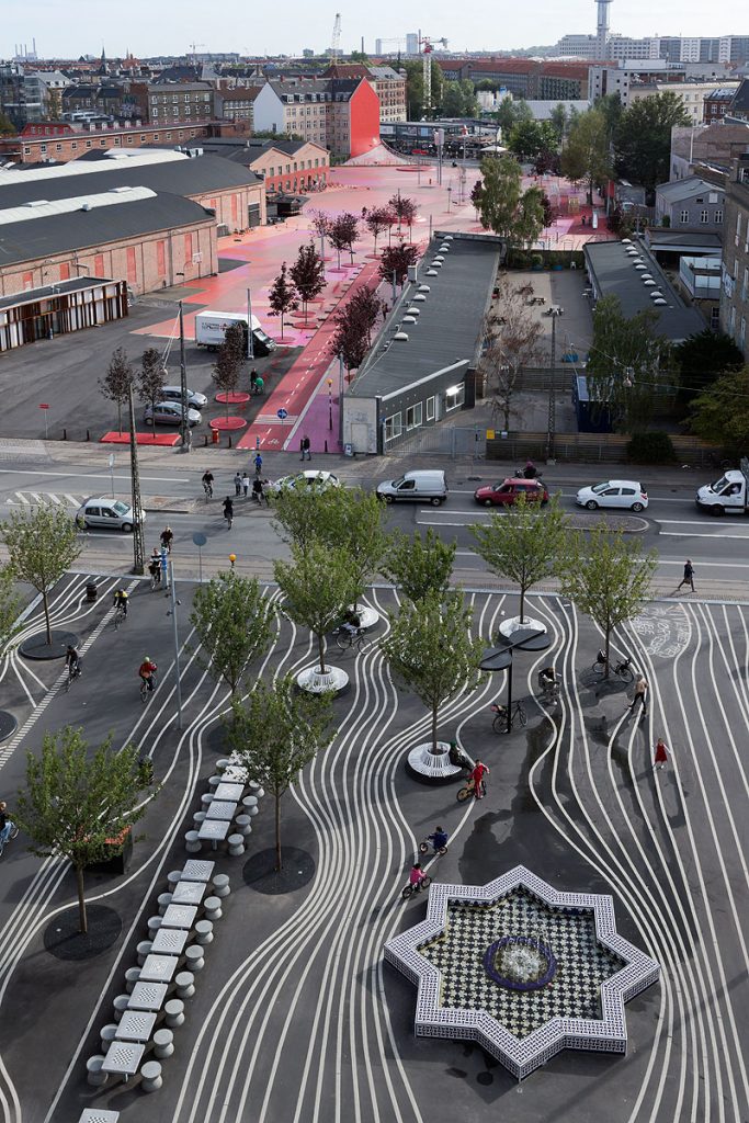
In addition, colour-coding techniques can be used to highlight pedestrian routes or to show directions to key places / districts that the city wants to promote. As shown in the two photos below, colour-coding can help create land uses on the public realm where multiple users and activities can coexist without any discomfort, whilst the aesthetics of the environment itself are improved.
In the case of Milan, same measures could be applied to highlight routes for example to all the portas around the inner circle leading consequently to key neighbourhoods like Porta Venezia, Porta Nuova or Porta Ticinese.
Light up Milan
Light installations could be another useful tool. They can be either temporary to promote specific events and festive periods or permanent to signalise specific landmarks in the city centre. Light installations can be a form of art, but also a strategic way to promote places.
The example of Canary Wharf in London, is the best way to describe this strategy. Canary Wharf used to be an industrial land that was later bought by developers and planned to be transformed into a mixed use financial hub. Few years have passed since the new identity was established and many events have been organised to promote the area and attract people.
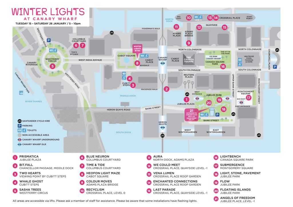
In fact, I was one of those people; I had never been in Canary Wharf before, till when I got this notification for the Light Festival event. The event was aiming to introduce the area to the newcomers; the light installations were not placed in the centre of Canary Wharf, but on the contrary, they were spread around the area, in key locations. In addition to this, visitors were given a map of the area highlighting the location for each light installation. This strategy, disguised in a form of an art-led game, was a great incentive to make people go all around the area without even realising it.
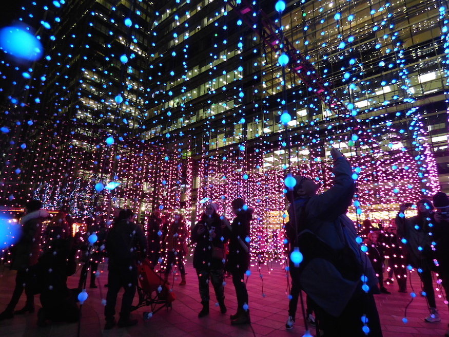
The power of social media can reinforce these initiatives even more. Transforming locations into instagramable places, can draw lots of attention and shape a place-branding strategy. The same thing happened with “I AMSTERDAM” sign which is a must photo for everyone visiting Amsterdam and it is also part of the city’s place-branding strategy. This is to show that low-cost interventions can have a bigger impact if they are well branded.
In the case of Milan, the “I AM AMSTERDAM” equivalent could be a sign that would regularly change based on what kind of week would be in Milan; fashion week, sports week or even shopping week. If that was smartly promoted in social media what impact do you reckon it would have?
Smart sign posts and touristic maps
Moving to something more explicit, sign posts are straightforward ways to help navigation around the city. However, any decision on graphics, or location could be harder than one might think and it would again require a strategic thinking. Graphics would have to be clear enough to highlight key areas and integrate smart technology to be interactive and engaging with the public. In terms of location, the key areas would need to be agreed first in order to strategically place the sign posts. This tool could be combined with colour-coding techniques.
Tourist maps is another tool that can be useful in wayfinding and it is often used by tourists. These maps should also serve the high-level purpose of the vision for the place and for that reason they require strategic thinking as well. For example, since there is no street hierarchy in the Milan city centre, these maps could offer this exact information by colouring each road as main, secondary, tertiary highlighting the landmarks that can be found along them. The location of sign posts or other colour-coded designations (cycle lanes, key routes) could be also shown in the tourist maps.
Street furniture or anything art-led can become a statement
Signage techniques are not only related to sign posts and maps. Any element can become an art piece and facilitate wayfinding in a place. For example, art-led street furniture can make a statement, whilst promoting a specific street, district or even neighbourhood.
FINAL THOUGHTS & CONSIDERATIONS
The competition between countries during the industrial era now seems simpler; value of the land, labour costs and quality of goods. Today’s era has shifted towards services and the challenge now is how to best promote them. Building a name for a place is highly important and entirely connected with the services offered. Place branding is now a top priority for big cities that are trying to compete with others over quality and types of services.
Milan is already in this fight. Being a city of fashion, art, sports, education, it wants and needs to become more GLOBAL. Milan has opened its services to an international level, not only local. The city already has a vision and objectives, yet, these are not fully integrated into a strategic framework for place branding.
Existing urban elements within the city fabric, however unique and characteristic they are, contradict this vision. These characteristics (street network, green open spaces, independent shops etc.), if not well branded, can be easily turned into constraints affecting the way people perceive the city and ultimately the overall vision. Place branding can help mitigate these threats and build a strong framework which will ensure that all the proposed ideas are aligned with this vision.
In this blog post, examples of signage and wayfinding techniques were presented to help with place branding. Of course, there are a variety of other urban techniques that can be applied as well, however, the aim was to highlight that thinking BIG does not always mean designing BIG as well. Resilience is important and it has been proven that it is safer to start with small-scale, low cost interventions before going for the big ones.
LIST OF FIGURES & USEFUL LINKS
Books & articles
- The big European sort? The diverging fortunes of Europe’s regions (https://www.cer.eu/publications/archive/policy-brief/2019/big-european-sort-diverging-fortunes-europes-regions)
- The Guardian. How European cities stole continents wealth. (https://www.theguardian.com/cities/2019/nov/10/how-europes-cities-stole-continents-wealth)
- Britanica. The evolution of the modern city (https://www.britannica.com/place/Milan-Italy/Evolution-of-the-modern-city)
- Birtanica. Milan since 1915 (https://www.britannica.com/place/Milan-Italy/Milan-since-1915)
- Milan global. (https://milanglobal.in/)
- Wikipedia. Place branding (https://en.wikipedia.org/wiki/Place_branding#:~:text=Place%20branding%20)
- Figure 1. Link: https://www.google.com/imgres?imgurl=https://i.pinimg.com/236x/0d/86/33/0d863383d367f5f3240835245332afb4–map-metro-milano.jpg&imgrefurl=https://www.pinterest.com/katerina_hrist0/bergamo-milano-verona-modena/&h=330&w=236&tbnid=xeH24fgVZu2s-M&tbnh=266&tbnw=190&usg=AI4_-kRw1UkFP1-wGbNmZYcG3UMYqiNJVw&vet=1&docid=O7wSBdZQY1CduM&itg=1&hl=en-GB
- Figure 2. Link: https://www.google.com/search?q=london+cycle+lanes&sxsrf=ALeKk00SxGPdiDqHedrGn5SOCxU0Fc_rwA:1608406562887&source=lnms&tbm=isch&sa=X&ved=2ahUKEwjt7tau5drtAhVIeMAKHQ2PCyEQ_AUoA3oECBQQBQ&biw=1193&bih=1280#imgrc=0s4zeW5htxc5wM
- Figure 3. Link: https://www.superfreshdesign.com/#/williamsburg-asphalt-mural/
- Figure 4. Link: https://www.archdaily.com/286223/superkilen-topotek-1-big-architects-superflex/5088cd8428ba0d7525000100-superkilen-topotek-1-big-architects-superflex-photo
- Figure 5. Link: https://londonist.com/london/free-and-cheap/canary-wharf-winter-lights-2020
- Figure 6. Link: https://www.google.com/search?q=canary+light+installations+map&tbm=isch&ved=2ahUKEwjYuaji_NrtAhUFLxoKHVbGAS0Q2-cCegQIABAA&oq=canary+light+installations+map&gs_lcp=CgNpbWcQA1D5uAFYlLwBYNu9AWgAcAB4AIABR4gB-gGSAQE0mAEAoAEBqgELZ3dzLXdpei1pbWfAAQE&sclient=img&ei=rW7eX5ivC4XeaNaMh-gC#imgrc=qrWGY_M3xnsYmM
- Figure 7. Link: https://www.google.com/search?sa=G&hl=en&tbs=simg:CAQSrQIJZnzJSvPvdwIaoQILELCMpwgaYgpgCAMSKMMX_1QyGDaAXrRiiGMUQ4QyjGP4MgDaMNpEokCjYMNgvjCj_1NbowkigaMG5auvftiBSms9phZ1-erVjJII-iUImiGq3yB9YHtb5LfbWWVxefJ2S9wnPaGRfhPyAEDAsQjq7-CBoKCggIARIEX5rgvAwLEJ3twQkamQEKGwoIY3VzdG9tZXLapYj2AwsKCS9tLzAxajBtawomChNkaXNwbGF5IGFkdmVydGlzaW5n2qWI9gMLCgkvbS8wMl83ODQKFgoEY2l0edqliPYDCgoIL20vMDFuMzIKGQoHbWFjaGluZdqliPYDCgoIL20vMGRrdzUKHwoMYXJjaGl0ZWN0dXJl2qWI9gMLCgkvbS8wM25mbXEM&sxsrf=ALeKk00Ytq4A0y9tosj1JksnJJbFf-lrDA:1608413762343&q=interactive+outdoor+digital+signage&tbm=isch&ved=2ahUKEwiu6NKXgNvtAhUTnVwKHafgD6MQwg4oAHoECA4QMQ&biw=1193&bih=1223#imgrc=K3eW8qJ6Ips8ZM
- Figure 8. Link: https://www.google.com/search?q=long+bench+littlehampton&sxsrf=ALeKk02XV7EODS7Q4GgWf6_sO5PZucWoGA:1608415028926&tbm=isch&source=iu&ictx=1&fir=r4qz_iBJUmBvXM%252CDYLi7xA3QWS_PM%252C_&vet=1&usg=AI4_-kTV5ArTWm6-0mnBIw6naMxFZ_8E4g&sa=X&ved=2ahUKEwjF6MzzhNvtAhXtTRUIHZH4CJ0Q9QF6BAgKEAE&biw=1193&bih=1223#imgrc=r4qz_iBJUmBvXM